
By Staci L. Smith

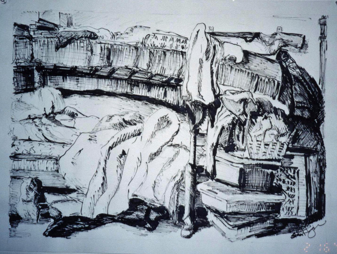
 pencil still life- choose your own angle
Art- in every form has some rules, and I think they
transcend medium. I have been thinking
a lot about what makes great jewelry designs special. There
are many answers to this, surely, but I think there is one common theme. Composition.
I found the answer deep in my memory of those classes. It may come natural to some, but it can
always be learned, and explored further.
It’s what makes the difference between observing something that makes
you want to look longer, and explore it deeper, or looking at something and
moving on.
 (charcoal- single light night study)
I found my old Vocabulary
of Form sheet from my 2-D design class and wanted to share some of them
with you. I think just reading these
allow us to see how they play into our designs as jewelry makers.
Balance- a
feeling of equilibrium in weight, attention, or attraction that is achieved by
using various visual elements within an artwork to accomplish organic unity.

Symmetrical balance-
a form of balance achieved by using identical units placed in mirror like
repetition on either side of a central axis.
Asymmetrical balance-
a form of balance in which unlike ways and / or means are used to achieve a
“felt” equilibrium

Dominance- the
principle of visual organization that suggests that certain elements should
assume more importance than others in the same design or composition. Some features are emphasized while others are
subordinated.
Variety- the use
of opposing, contrasting, changing, elaborating or diversifying elements in a
composition to add individualism and interest; the counterweight of harmony in
a work of art.

Harmony- the
related qualities of the visual elements of a composition. Harmony is achieved
by repetition of characteristics that are the same or similar.
Motif- a visual
elements or combination of elements that is repeated often enough in a
composition to make it a significant feature of the artist expression; a design
that is repeated within a larger design.

Negative areas-
the unoccupied or empty space left after the imagery has been created by the
artist. However, when these areas have
boundaries, they also function as design shapes in the total artistic
structure.
Repetition- the
use of the same visual effect a number of times in the same composition. Repetition may produce the dominance of one
visual idea, a feeling of harmonious relationship, an obviously planned pattern
or a rhythmic movement.
Rhythm- a
continuance, a flow, or a feeling of movement achieved by repetition of
regulated visual units; the use of measured accents.

(ink of my hubby lookin' hot at the beach)
OK- so you read them,
now what? I am sure you could recognize
some of the ways you use these definitions in your work. But I think you can also now see what you may
want to strive for. Perhaps you have a piece where
you want to convey harmony, or tension.
The definitions above may be able to help you achieve your desired
outcome.
Being a predominantly asymmetrical designer, here are some
rules I live by………………..
1.
Start with the focal and build your piece from
there- decide if it will be the dominant feature or part of a pattern, or a
motif.
2.
Rule of
three: when designing, use either one
large or three small in a row. Never two
small or four. Using three seems to keep
the eye hungry for one more and thus keeps it moving through the design.
3.
Carry at least two elements through the piece to
create your “felt” equilibrium. Either a
color or a shape or texture. Each one
doesn’t have to be repeated more than once on each side.
4.
The rest are top secret (just kidding).

I hope reading some of these definitions help with your
future designs. Whether you create
jewelry to be visually appealing alone, or want to give it meaning, I think we
can all explore composition a little deeper and allow it nurture our designs.

For me it has really been a journey to go back through my
old folders, and pictures I have of my favorite projects from school. I can really see my “style” in the drawings,
and feel like I have achieved that same style in my jewelry designs. I had no idea how much my drawing background
affected my jewelry, and how strong my style has been, through many mediums,
through many years. So in reference to the post
from Barbara yesterday, I enjoyed looking back.
*All drawings were by me during college around 1999- don't laugh, I was really proud of them!
4 comments:
what a terrific look back... i agree, staci - one should have a working knowledge of the elements of art and principles of design... creating is not merely a right brain activity... i think that is why i feel so spent after concentrating on something for a while - there are a lot of decisions to make... and while the muse is certainly necessary (hoping that mine has thus far not taken offense), it is amazing when you look back at a piece and realize how many choices you made along the way to achieve the effect you did... and yes, yes, yes to odd numbers...
... I can so relate to your college art course......... I was SO very disappointed! I was ready to tackle the world in that class, and could only do 2D pencil sketches.. hmmmmmmm
I think too though, art and creativity are just "IN" us. It's a need that we must express. And in that expression, a lot of these guidelines and rules occur naturally.
GREAT post,Stac!!
Awesome post! You should be very proud as you are an extremely talented artist whether it be on paper or in your jewelry.
What an enjoyable and informative post!! I loved looking at all of you drawings. You made me laugh too..... ;o)
I felt like I got to know you more as you came through in each piece. I do try to remember the vocab. when I create... After all, I live with an art teacher. I'm not always the best student, however!
MaryAnn
Post a Comment