
by Sherri Stokey

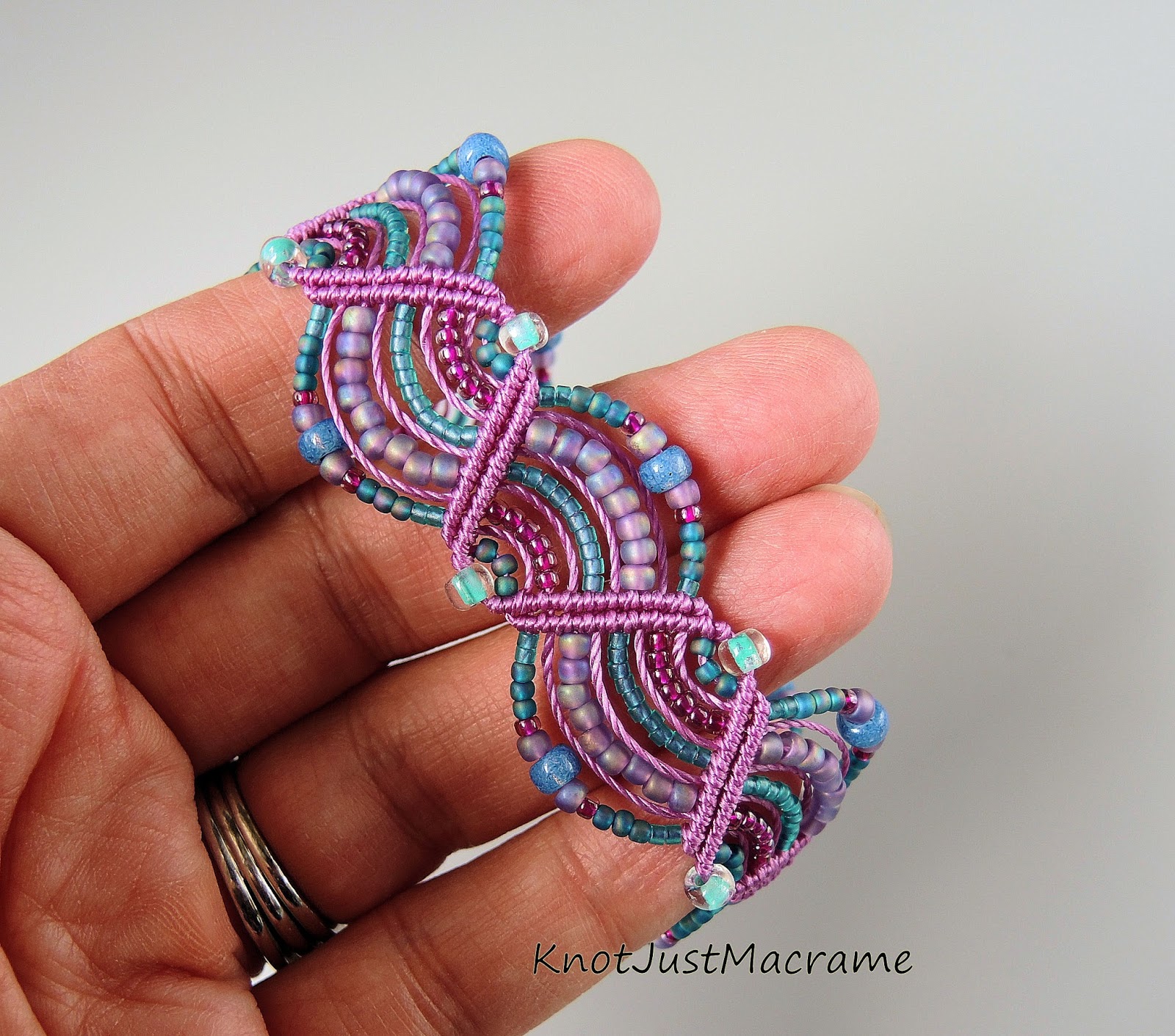
Have you noticed how many gorgeous pictures go scrolling by daily in your social media feeds? Those photographs can be great color inspiration for design. I loved the jewel tones in this one and pulled out beads and cord in aqua, lavender, orchid and slate blue, then started a design using the aqua cord and a mixture of beads. (If you're trying this and are having difficulty pulling colors from the photos, there are some great sites online to help you with that like Kuhler and Color Palette FX.)

Then I switched out the cord for orchid, but used all of the same beads. It looks very different, don't you think?
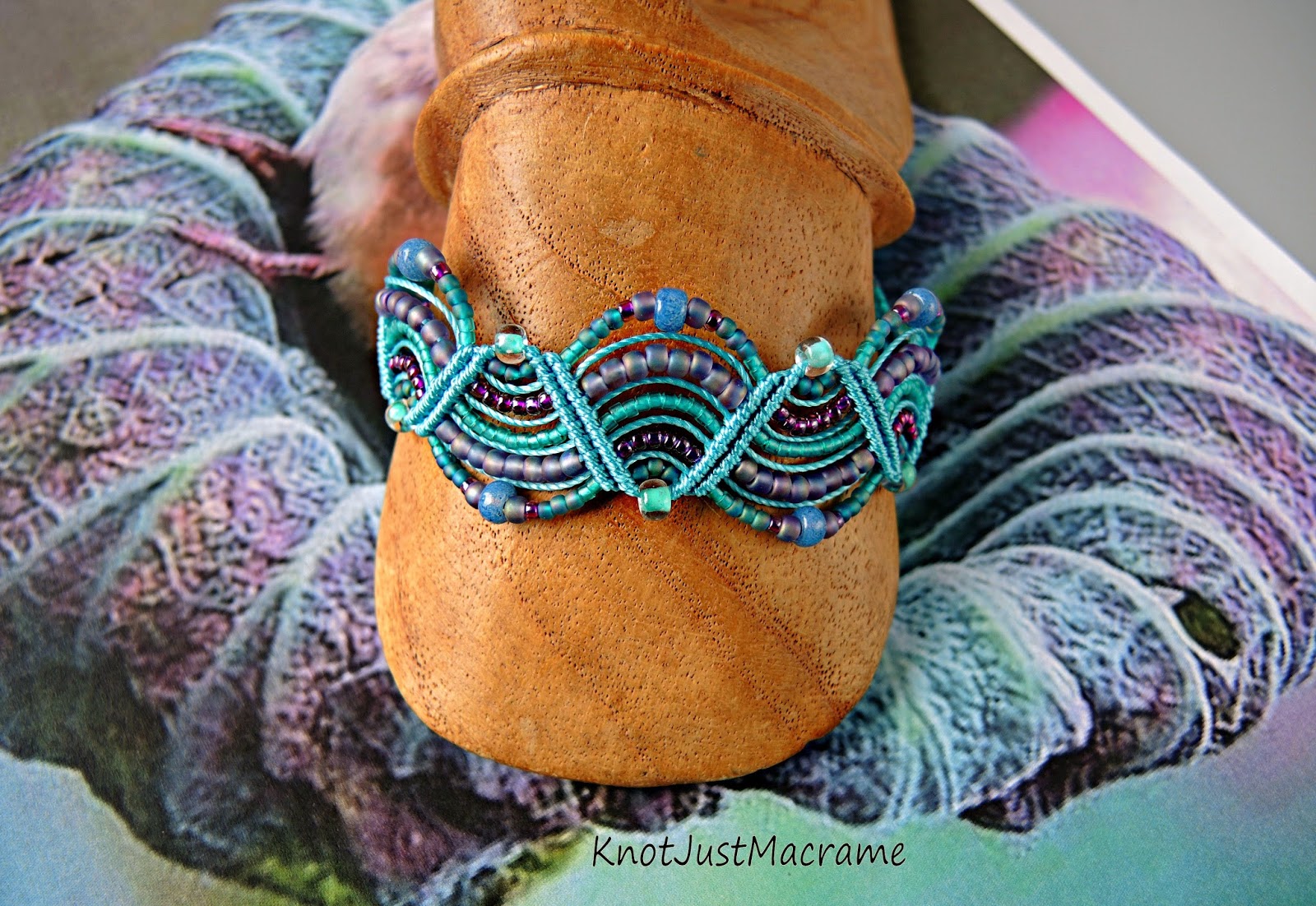
Not only is the overall look different, but the individual beads even appear to be different colors. That, of course, led to trying one more version with slate blue cord.

All of these pieces were inspired by that one photo and there are still many variations to be explored. I could introduce a bit of the green into the mix or concentrate more on the pink tones. I also see a ribbed texture and some webbing that would be fun textures to try to mimic.
Where have you been finding your inspiration lately?
3 comments:
Your work is always beautiful! You have a wonderful eye for colour!
It's amazing and how beautiful each bracelet is depending on the thread color that you used. Lovely bracelets.
~cryssT
I love your color play! I also enjoyed seeing how different the Bead color is against different cording. Amazing how our eyes interpret color
Post a Comment