Showing posts with label color. Show all posts

Monday, July 20, 2015

Color Play

by Sherri Stokey


Have you noticed how many gorgeous pictures go scrolling by daily in your social media feeds?  Those photographs can be great color inspiration for design.  I loved the jewel tones in this one and pulled out beads and cord in aqua, lavender, orchid and slate blue, then started a design using the aqua cord and a mixture of beads.  (If you're trying this and are having difficulty pulling colors from the photos, there are some great sites online to help you with that like Kuhler and Color Palette FX.) 


Then I switched out the cord for orchid, but used all of the same beads.  It looks very different, don't you think?  


 Not only is the overall look different, but the individual beads even appear to be different colors.  That, of course, led to trying one more version with slate blue cord.


All of these pieces were inspired by that one photo and there are still many variations to be explored.  I could introduce a bit of the green into the mix or concentrate more on the pink tones.  I also see a ribbed texture and some webbing that would be fun textures to try to mimic.


Where have you been finding your inspiration lately?


Thursday, December 11, 2014

Textures, Color and Fibers

As a nature lover and ceramic artist, it is easy to say that I am inspired in my work to create textures often repeated by what I see in nature.
With Ceramics, it is usually in my hand carved texture plates (which I later use when bisque fired - hard and porous) that show the textures. I use those plates to press porcelain or stoneware clay into to create a reverse printed texture.

When it comes to using my ceramic pieces in finished jewelry, I tend to stall a bit.
This I believe is because there are so many possibilities, I have a hard time getting my brain to settle and focus on one technique (talk about ADHD!)
And I'm all about the quality, so I tend to work things through a few times before I come up with something I'm happy with (this bracelet below is still a work in progress).

 When it comes to colors, these Hand Painted Silks (painted by Ute of Silk Painting is Fun) that I have been carrying now for over 10 years, are an endless supply of inspiration.
Marsha Neal Studio presents Silky and Fairy Ribbons

Marsha Neal Studio presents 2mm Hand Painted Silks
 I love to pick through and make specific color palettes from the 80+ colors I carry (in three styles: Silky Ribbon, Fairy Ribbon, and 2mm round).
 And I am seriously delighted with every order that comes through because I get to see a bit into what you are picking out and are working with for your jewelry (or other) designing.
If you are interested in using these in your work to add color and texture, you can shop for these ribbons through my Etsy shop or my Marsha Neal Studio website.

Recently I have been fiddling more and more with Needle Felting Wool Roving and Locks (see SarafinaFiberArt for beautiful supplies). And luckily Sarafina Art House is about 25 minutes from my house/studio and I have picked up working there part-time, helping with orders, stock, and whatever they need me to jump in and do. Which is a whole other chapter opening up in my creative life - working outside of the home around other creative positive people helping run that business is SO what I need right now.

What kind of fibers are you into using?
And what techniques make you giddy?

Look for some posts on fibers (all kinds of fibers) coming up in the next couple of months as we get through the holidays and back to our creative time.

Wednesday, October 9, 2013

New Polymer

by Barbara Bechtel
Today I thought I would show you some of my most recent polymer clay beads. Admittedly, for most of the last year, I haven't been making much new polymer clay work and have mostly been working in copper. A recent injury has kept me sidelined for several months, and once I started feeling a bit better but still couldn't get into my metal studio, I felt that polymer itch.


This is actually the front and back sides of a double sided focal donut.

Not wanting to burn myself out again, I started in on creating some new color palettes. My polymer clay has always been an extension of my background as a painter and I prepare each piece almost as a mini canvas, spending the majority of the time preparing, building the base, and layering and creating depth through the surface treatments in layers of color and translucency through the careful selection of a color palette.
Transparency and opacity are very important in the colors I select and how much I remove or add to each surface.

At the current moment, I'm not getting to wild with the shapes and forms, but instead using the same or similar forms, really searching for and working beyond the obstacles of each palette. I almost like to think of them as tiny sketches or color studies.


If you'd like to see more of my recent explorations in color, I encourage to pop over to my Facebook page and check out more of the photos there!

Thursday, September 6, 2012

coloring metal, cont'd

mary jane dodd


julie spoke of ways to add color to metal yesterday and i wanted to continue the conversation as the use of patina has become quite near and dear to me... 

aside from los and salt & vinegar, i hadn't used anything in the way of patina... 

but there are times and places that you need just that in your designs... 

i love sculptor's grade patina - 


the use of opaque and translucent... layering, buffing, adding powders for sheen... 

i learned of it through shannon levart a.k.a. missficklemedia who has put together a wonderful tutorial.... 

as with anything, there is a learning curve, but shannon's tutorial is very informative and helps to explain the whole process.... this is truly one of the techniques that i am most grateful to have in my arsenal... 


and you can see how addicting it is!

Wednesday, January 25, 2012

guest post - kerry bogert

Hey LMAJ Readers!

I couldn't be more excited to be invited to share a post with you here today. What better way to start a dreary, rainy, Tuesday than with a bit of art jewelry love? I don't know about where you live, but in my western New York neck of the woods, the weather has been rather unwinter like. It seems like every Tuesday we are seeing a rising of the thermometer and down pouring of rain. Sure, my hubby likes that he isn't having to shovel the driveway every morning before work, but the constant state of muck brown we find ourselves it leaves a lot to be desired (or should I say inspired). 

One day last week, for my blog, I set out on a little adventure to find a color-of-the-day, all day long. Wouldn't you know it, the Pantone color of the day was... brown. It was a great exercise in opening my eyes to the possibility and beauty in brown. If you are familiar with my current body of work, you'll know that brown is a color that rarely makes an appearance. I am so much more of a BRIGHT color kinda gal. And now, between that photographic lesson and the doldrums outside my window, I am so completely over brown. 

So, I decided to go on another adventure, around my house, to document a spectrum of colors with some texture thrown in for good measure. 


You might be asking yourself what apples and old records have to do with creating art jewelry.  For me, finding ways to be creative everyday and seeing color whereever I can is just one of the ways I stay motivated/inspired/refreshed when it comes down to sitting at my beading table to work. It keeps the idea juices flowing and my brain from turning to as mushy a brown as my backyard. For example, after taking these photos, that orange Royal Kerry tea tin has me thinking beads made with a light orange, dark grey, and ivory would make for an interesting combination. 

I invite you to join me today on a color adventure of your own! Challenge yourself to take your camera in hand, around your home, and find bits of color in your own environment. Come back here to the comments and share a link to a color photos on your blog! Share too what this little color adventure inspired in your work.


-------------------------------------------------------------------------------------


you can learn more about kerry in these places:


Saturday, December 17, 2011

guest post - marianne kasparian


Hi there! I’m “Mak” (Marianne Kasparian) of MAKUstudio. I love raku and can truly say that I have found my passion. I remember getting a palm/psychic reading when I was younger and they told me that I wouldn’t find my career path until later in life…that I would try several things before finding the right one. I was perplexed at the time, but the wait was definitely worth it and my life experiences somehow brought me right to where I’m supposed to be. From three years of high school ceramics, design and color courses in college, a degree in Textile Marketing, taking metalsmithing after graduating when I decided I wanted to be a jeweler…to working at a bar that had 1000 beers, driving across country by myself and coming to a point in my life when I had to do much soul searching. These things all make me who I am today…a creative soul. I live to raku, and raku to live (in more ways than one). 


At all my shows, I ask my customers if they are familiar with raku. Of course, it depends on the show, but I’d say 8 out of 10 have never heard of it. So, I’d like to tell you a little bit about the firing process which I adore.


As far as the actual process of getting to my final product:
*first I create the pieces out of clay
*then let them dry and sand the pieces to make sure backs are smooth and there are no sharp protrusions of clay
*then I bisque fire them in an electric kiln to harden them and get them ready for glazing
*then I wash the pieces to get any clay dust off them so that the glazes look good on the final pieces
*then I glaze the pieces (this is the most time consuming!)
*then I raku fire the pieces in an outdoor kiln (which my husband and I built ourselves).


The raku firing involves a fast firing that goes to over 1800 degrees F (for the most part), then pulling the pieces out of the kiln while they are red hot using special gloves and tongs and placing them in a reduction chamber (small can) filled with organic materials such as newspaper, leaves or sawdust; the organic materials catch on fire and the lid is then placed on the can; the fire wants oxygen to keep going and pulls it out of the glazes themselves; smoke is created, creating the matte black look of raku wherever there is no glaze; the pieces are left in the can to cool, then removed and scrubbed clean of the ashes and voila! There are many variables which can affect the final outcome of the glaze including the weather (humidity, wind, rain, temperature), how large or small the reduction chamber is, how long I take to get from the kiln to the can, how much organic material I put in the can, what type of material is in the can, and many more. That’s why raku is truly one-of-a-kind!


I hope my creations bring you much inspiration…that is what truly inspires me.


----------------------------------------------------

you can learn more about marianne and purchase her work on
her etsy shop
her website
or her facebook page... 

thank you, marianne for sharing your work and process... 


Tuesday, December 6, 2011

Sublety of Color and Shape: Designing artful holiday jewelry

I've never been one to dress to the season. You won't find me wearing festive Swarovski crystal snowman earrings or wearing a jingle bell around my neck. Today I thought I would explore some different ideas for creating  in the holiday spirit! I started with the simple idea of a candy cane to see how artists interpreted this theme differently than the norm.


found here


1) Use texture or pattern to suggest an idea subtly. By simply changing the angle of a line or texture stripes this ring takes on the structure of a peppermint stick without the calories!

found here


2) Color and unexpected materials come together in these great red and white earrings made from recycled newspaper! How can you interpret holiday color schemes into your work either by use of materials or technique?


found here

3) Is your design versatile? By simply using red and white, these earrings could easily complement many different outfits and holidays.


What ways do you involve Christmas, Winter, and Holiday Color schemes into your work? Have you designed interesting jewelry that transitions well into the holidays?


Saturday, October 15, 2011

this is a warning -

mary jane dodd


monday's designer is going to require a random draw because we have some terrific entries in our flickr group for this month's art spark! (and as a libra, i really struggle with having to make choices)


how about i show them to you?


swinging paddles from melinda orr:


fluttering leaves and beautiful colors from sandra:


a warm autumnal lariat necklace from supere67 (i am sorry i don't know your name):


swingy fall earrings from lorelei eurto:


yummy orange & copper from deborah lee taylor:


and a gorgeous rustic necklace from our own staci:


thank you ladies for your participation... 

enjoy your weekend!

i will be leaving the zen nest of my workbench and entering the belly of the beast - comic con nyc... wish us luck! (it's no big deal, not really - only about 10,000 people on the floor at a time... ommm...) just kidding - it's all good!


Monday, October 10, 2011

color and movement


october's art spark is underway - 

these great examples of color and movement come from our 'strut your stuff' flickr group... 


greer of vintajia adornments

rebecca of adobe sol

 sophia of kosmimata

bruno hempel

carol of terra rustica

looking forward to seeing what you are inspired to make!


Monday, October 3, 2011

october art spark

mary jane dodd

'every leaf speaks bliss to me,
fluttering from the autumn tree.'
~ emily bronte


trees bursting into flames of orange, red, yellow... leaves falling like rain... rustling against your shoes as you shuffle through them... finding yourself unable to resist their pull... 

your challenge for the month - 


color and movement...


there are many ways to create movement in a piece... using split rings and wrapped loops to dangle beads are some easy ones... 


but i really love wire paddles and trapeze components - i find them to be fun and versatile...


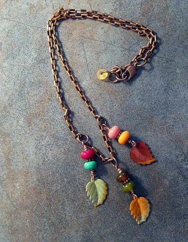
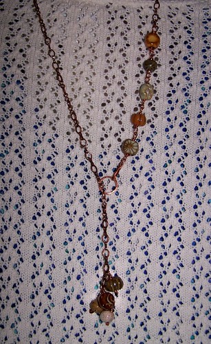
a trapeze can have a wire across the top to hold more beads (here i used lampwork glass by mika collins at pinocean) ...


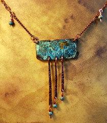
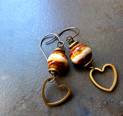
this trapeze has an open top and uses a wire paddle to highlight a special bead (here a lampwork glass bead by our own patty lakinsmith)... 


if you would like to try these, you don't need much... 


12 or 14 gauge wire for the trapeze
18 gauge wire for wire across the trapeze
14 gauge wire for the paddles
(all wire purchased at the hardware store)
beads
mini washers, bead caps
a hammer
a bench block
round nose pliers
chain nose pliers
flush cutters
metal file
something round to wrap wire around - ring mandrel, prescription bottle, anything you can find in the house that does the job... 


for the paddles...


cut a 2" piece of 14 gauge copper wire... file one end... when you hammer metal, you move it... to create paddles begin in the middle of the wire and work your way down towards the end... the more times you hit, the flatter and wider it will become... so you want to hammer the most down at the end to create a wide paddle shape... if you have rough edges, use your file... remember, files work in the stroke moving away from you... use it only in the one direction, never using a sawing motion, as it will dull the tool... 


slide a bead down the wire to see where (and if) it stops... i use washers or bead caps to adjust the placement of my bead... personally, i like when the earrings aren't symmetrical... 

the beads on the earrings above have very small holes and didn't require any washer at all... 

the holes in these beads happen to be a bit larger... 


for the pendant i chose bead caps... 


using your round nose pliers you will create a loop at the top (trimming off excess first if you feel it is too long)... place loop over your ring or trapeze and tighten with chain nose pliers... 

the trapeze is simply constructed as well... 

(here i work off of the longer piece of heavier wire)
wrap wire around a ring mandrel, prescription bottle, wooden dowel, handle, hammer head, anything that does the job... 
cut opposite side... 


using your round nose pliers, create loops at either end... you have a choice of whether to orient them to the side or the back... 


i usually hammer at this step and use my fingers to work the shape the way i would like it... hammering work hardens the metal and allows it to keep its shape better... my aesthetic choice also happens to be a bit more rustic... if you have a tumbler, you can keep your piece round and shiny and harden the metal that way... 

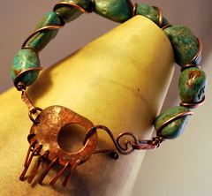
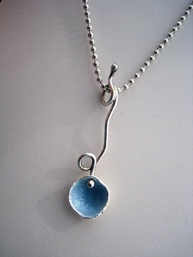
in the finished pieces above you can see how the different loop orientations affect the design... in this one i ran ball chain through the loop... 


please do not feel limited by these ideas - they are just that... create movement and color in your own beautiful way... we are waiting to see your interpretation... 

now for the rules of the art spark: 

1. all work submitted must be 75% handmade - you can use components made by others - but we encourage you to experiment as well... 

2. please submit your images to our flickr group... unlimited submissions per artist, up to 3 views of the piece... however, you will be entered once for our monthly giveaway... and you will be in the running for designer of the week once as well (we need to spread the love, right?)...

3. along with the image, a glimpse into your process, some insight would be appreciated... also please give credit for any work that is not your own... 

4. your work does not have to be completed jewelry... if you wish to submit images of components you make, that is just fine... again, some insight into how it relates to the theme of the month would be great... 

here is what our sponsors have donated for the month:
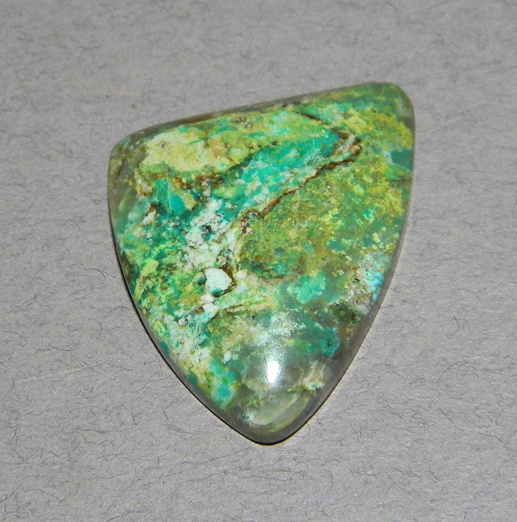
dvd on cold connections

cabbing rough

gorgeous enamel work from


how it works:

a weekly designer is chosen from the flickr group on mondays... 

a randomly chosen participant on october 31st will be the winner of items donated by our sponsors... please have your images uploaded by the 30th, i would hate for anyone to be overlooked because of this... 

*** this is the one year anniversary of our challenges - thank you to all those who have participated in the past and will participate in the future... we value the symbiotic relationship that has developed... we learn from you as (hopefully) much as you learn from us... the collaborative nature of this community is one we are proud to be involved in... 


face
Related Posts Plugin for WordPress, Blogger...